Widget
This module contains different stateless view functions. No wiring required.
These widgets should be used by defining the styling seperately:
Widget.button Material.primaryButton
    { text = "disable me"
    , icon =
        FeatherIcons.slash
            |> FeatherIcons.withSize 16
            |> FeatherIcons.toHtml []
            |> Element.html
            |> Element.el []
    , onPress =
        if isButtonEnabled then
            ChangedButtonStatus False
                |> Just


        else
            Nothing
    }
Every widgets comes with a type. You can think of the widgets as building blocks. You can create you own widgets by sticking widgets types together.
Buttons
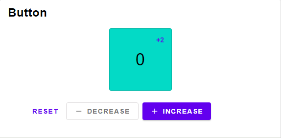
Button widget type with no icon
A button containing only an icon, the text is used for screenreaders.
A button with just text and not icon.
A button containing a text and an icon.

Select widget type
Technical Remark:
- A more suitable name would be "Choice"
A simple button that can be selected.
Selects one out of multiple options. This can be used for radio buttons or Menus.
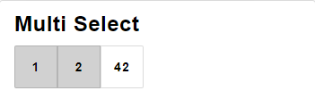
Multi Select widget type
Technical Remark:
- A more suitable name would be "Options"
Selects multible options. This can be used for checkboxes.
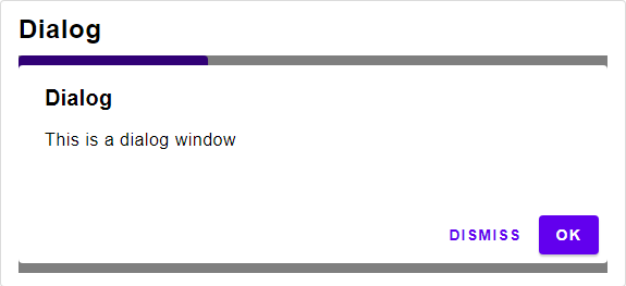
Dialog widget type
A modal.
Technical Remark:
- To stop the screen from scrolling, set the height of the layout to the height of the screen.
A Dialog Window.
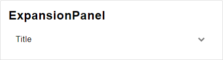
Expansion Panel widget type
An expansion Panel
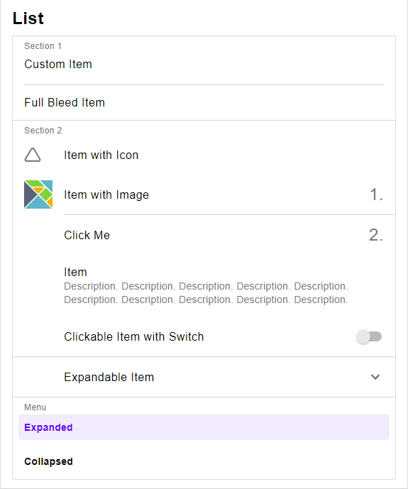
Replacement of Element.row
Replacement of Element.column
A row of buttons
A column of buttons
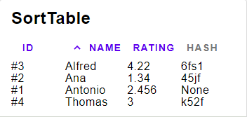
Sort Table widget type
Column for the Sort Table widget type
The View
A Column containing a Float
A Column containing a Int
A Column containing a String
value >> toString field will be used for displaying the content.
value will be used for comparing the content
For example value = String.toLower will make the sorting case-insensitive.
An unsortable Column, when trying to sort by this column, nothing will change.
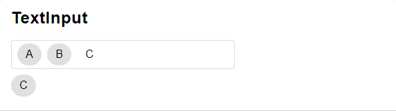
Text Input widget type
A text Input that allows to include chips.
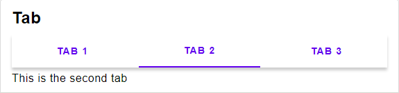
Tab widget type
Displayes a list of contents in a tab
Button widget type