Orasund/elm-ui-widgets/2.3.0

NOTE: the latest version is 3.4.0

Widget

This module contains different stateless view functions. No wiring required.

These widgets should be used by defining the styling seperately:

Widget.button Material.primaryButton
    { text = "disable me"
    , icon =
        FeatherIcons.slash
            |> FeatherIcons.withSize 16
            |> FeatherIcons.toHtml []
            |> Element.html
            |> Element.el []
    , onPress =
        if isButtonEnabled then
            ChangedButtonStatus False
                |> Just


        else
            Nothing
    }

Every widgets comes with a type. You can think of the widgets as building blocks. You can create you own widgets by sticking widgets types together.

Buttons
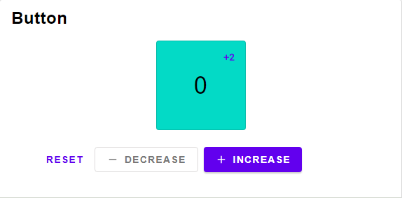
Button

Open in Ellie

type alias Button msg =
{ text : String
, icon : Element Never
, onPress : Maybe msg
}

Button widget type

type alias TextButton msg =
{ text : String
, onPress : Maybe msg
}

Button widget type with no icon

ButtonStyle msg
-> { text : String
, icon : Element Never
, onPress : Maybe msg
}
-> Element msg

A button containing only an icon, the text is used for screenreaders.

ButtonStyle msg
-> { textButton | text : String, onPress : Maybe msg }
-> Element msg

A button with just text and not icon.

ButtonStyle msg
-> { text : String
, icon : Element Never
, onPress : Maybe msg
}
-> Element msg

A button containing a text and an icon.

Switch

type alias Switch msg =
{ description : String
, onPress : Maybe msg
, active : Bool
}

Switch widget type

SwitchStyle msg
-> { description : String
, onPress : Maybe msg
, active : Bool
}
-> Element msg

A boolean switch

type alias Select msg =
{ selected : Maybe Int
, options :
List
{ text : String
, icon : Element Never
}
, onSelect : Int -> Maybe msg
}

Select widget type

Technical Remark:

  • A more suitable name would be "Choice"
selectButton : ButtonStyle msg -> ( Bool, Button msg ) -> Element msg

A simple button that can be selected.

select : Select msg -> List ( Bool, Button msg )

Selects one out of multiple options. This can be used for radio buttons or Menus.
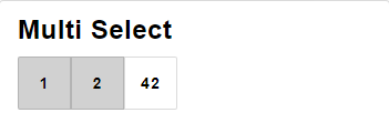
type alias MultiSelect msg =
{ selected : Set Int
, options :
List
{ text : String
, icon : Element Never
}
, onSelect : Int -> Maybe msg
}

Multi Select widget type

Technical Remark:

  • A more suitable name would be "Options"
multiSelect : MultiSelect msg -> List ( Bool, Button msg )

Selects multible options. This can be used for checkboxes.
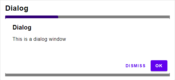
type alias DialogV2 msg =
{ title : Maybe String
, text : String
, accept : Maybe (TextButton msg)
, dismiss : Maybe (TextButton msg)
}

Dialog widget type

DialogStyle msg
-> { title : Maybe String
, text : String
, accept : Maybe (TextButton msg)
, dismiss : Maybe (TextButton msg)
}
-> List (Attribute msg)

A Dialog Window.

Expansion Panel

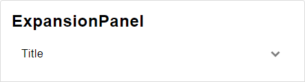
ExpansionPanel

Open in Ellie

type alias ExpansionPanelV2 msg =
{ onToggle : Bool -> msg
, icon : Element Never
, text : String
, content : Element msg
, isExpanded : Bool
}

Expansion Panel widget type

ExpansionPanelStyle msg
-> { onToggle : Bool -> msg
, icon : Element Never
, text : String
, content : Element msg
, isExpanded : Bool
}
-> Element msg

An expansion Panel

row : RowStyle msg -> List (Element msg) -> Element msg

Replacement of Element.row

column : ColumnStyle msg -> List (Element msg) -> Element msg

Replacement of Element.column

{ list : RowStyle msg
, button : ButtonStyle msg
}
-> List ( Bool, Button msg )
-> Element msg

A row of buttons

{ list : ColumnStyle msg
, button : ButtonStyle msg
}
-> List ( Bool, Button msg )
-> Element msg

A column of buttons

Sort Table

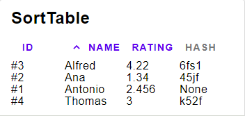
SortTable

Open in Ellie

type alias SortTable a msg =
{ content : List a
, columns : List (Column a)
, sortBy : String
, asc : Bool
, onChange : String -> msg
}

Sort Table widget type

type alias Column a =
Column a

Column for the Sort Table widget type

SortTableStyle msg
-> { content : List a
, columns : List (Column a)
, sortBy : String
, asc : Bool
, onChange : String -> msg
}
-> Element msg

The View

{ title : String
, value : a -> Float
, toString : Float -> String
, width : Length
}
-> Column a

A Column containing a Float

{ title : String
, value : a -> Int
, toString : Int -> String
, width : Length
}
-> Column a

A Column containing a Int

{ title : String
, value : a -> String
, toString : String -> String
, width : Length
}
-> Column a

A Column containing a String

value >> toString field will be used for displaying the content.

value will be used for comparing the content

For example value = String.toLower will make the sorting case-insensitive.

{ title : String
, toString : a -> String
, width : Length
}
-> Column a

An unsortable Column, when trying to sort by this column, nothing will change.
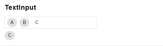
Text Input

textInput

Open in Ellie

type alias TextInput msg =
{ chips : List (Button msg)
, text : String
, placeholder : Maybe (Placeholder msg)
, label : String
, onChange : String -> msg
}

Text Input widget type

TextInputStyle msg
-> { chips : List (Button msg)
, text : String
, placeholder : Maybe (Placeholder msg)
, label : String
, onChange : String -> msg
}
-> Element msg

A text Input that allows to include chips.
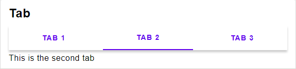
type alias Tab msg =
{ tabs : Select msg
, content : Maybe Int -> Element msg
}

Tab widget type

tab :
TabStyle msg
-> { tabs : Select msg
, content : Maybe Int -> Element msg
}
-> Element msg

Displayes a list of contents in a tab

Progress Indicator

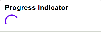
progress Indicator

Open in Ellie

type alias ProgressIndicator =
Maybe Float

Progress Indicator widget type

If maybeProgress is set to Nothing, an indeterminate progress indicator (e.g. spinner) will display. If maybeProgress is set to Just Float (where the Float is proportion of completeness between 0 and 1 inclusive), a determinate progress indicator will visualize the progress.

circularProgressIndicator : ProgressIndicatorStyle msg -> Maybe Float -> Element msg

Displays a circular progress indicator

DEPRECATED

type alias Dialog msg =
{ title : Maybe String
, body : Element msg
, accept : Maybe (TextButton msg)
, dismiss : Maybe (TextButton msg)
}

DEPRECATED

Use DialogV2 instead

type alias ExpansionPanel msg =
{ onToggle : Bool -> msg
, icon : Element Never
, text : String
, expandIcon : Element Never
, collapseIcon : Element Never
, content : Element msg
, isExpanded : Bool
}

DEPRECATED

Use ExpansionPanelV2 instead