Widget
This module contains different stateless view functions. No wiring required.
Widget.button Material.primaryButton
    { text = "disable me"
    , icon =
        FeatherIcons.slash
            |> FeatherIcons.withSize 16
            |> FeatherIcons.toHtml []
            |> Element.html
            |> Element.el []
    , onPress =
        if isButtonEnabled then
            ChangedButtonStatus False
                |> Just


        else
            Nothing
    }
Every widgets comes with a type. You can think of the widgets as building blocks. You can create you own widgets by sticking widgets types together.
Buttons
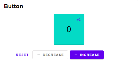
Button widget type
Button widget type with no icon
A button containing only an icon, the text is used for screenreaders.
import Widget.Material as Material
import Material.Icons as MaterialIcons
import Material.Icons.Types exposing (Coloring(..))
import Widget.Icon as Icon


type Msg
    = Like


iconButton (Material.iconButton Material.defaultPalette)
    { text = "Like"
    , icon = MaterialIcons.favorite |> Icon.elmMaterialIcons Color
    , onPress = Just Like
    }
|> always "Ignore this line" --> "Ignore this line"A button with just text and not icon.
import Widget.Material as Material


type Msg
    = Like


textButton (Material.textButton Material.defaultPalette)
    { text = "Like"
    , onPress = Just Like
    }
|> always "Ignore this line" --> "Ignore this line"A button containing a text and an icon.
import Widget.Material as Material
import Material.Icons as MaterialIcons
import Material.Icons.Types exposing (Coloring(..))
import Widget.Icon as Icon


type Msg
    = Submit


button (Material.containedButton Material.defaultPalette)
    { text = "Submit"
    , icon = MaterialIcons.favorite |> Icon.elmMaterialIcons Color
    , onPress = Just Submit
    }
    |> always "Ignore this line" --> "Ignore this line"
Switch
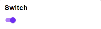
Switch widget type
A boolean switch
import Widget.Material as Material


type Msg
    = Activate


switch (Material.switch Material.defaultPalette)
    { description = "Activate Dark Mode"
    , onPress = Just Activate
    , active = False
    }
    |> always "Ignore this line" --> "Ignore this line"
Select

Select widget type
Technical Remark:
- A more suitable name would be "Choice"
A simple button that can be selected.
import Widget.Material as Material
import Element


type Msg
    = ChangedSelected Int


{ selected = Just 1
, options =
    [ 1, 2, 42 ]
        |> List.map
            (\int ->
                { text = String.fromInt int
                , icon = always Element.none
                }
            )
, onSelect = (\i -> Just <| ChangedSelected i)
}
    |> Widget.select
    |> Widget.buttonRow
        { elementRow = Material.buttonRow
        , content = Material.toggleButton Material.defaultPalette
        }
|> always "Ignore this line" --> "Ignore this line"Selects one out of multiple options. This can be used for radio buttons or Menus.
import Widget.Material as Material
import Element


type Msg
    = ChangedSelected Int


{ selected = Just 1
, options =
    [ 1, 2, 42 ]
        |> List.map
            (\int ->
                { text = String.fromInt int
                , icon = always Element.none
                }
            )
, onSelect = (\i -> Just <| ChangedSelected i)
}
    |> Widget.select
    |> Widget.buttonRow
        { elementRow = Material.buttonRow
        , content = Material.toggleButton Material.defaultPalette
        }
    |> always "Ignore this line" --> "Ignore this line"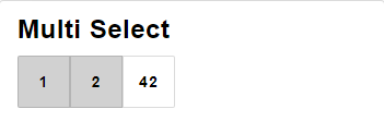
Multi Select widget type
Technical Remark:
- A more suitable name would be "Options"
Selects multible options. This can be used for checkboxes.
import Widget.Material as Material
import Set
import Element


type Msg
    = ChangedSelected Int


{ selected = [1,2] |> Set.fromList
, options =
    [ 1, 2, 42 ]
        |> List.map
            (\int ->
                { text = String.fromInt int
                , icon = always Element.none
                }
            )
, onSelect = (\i -> Just <| ChangedSelected i)
}
    |> Widget.multiSelect
    |> Widget.buttonRow
        { elementRow = Material.buttonRow
        , content = Material.toggleButton Material.defaultPalette
        }
    |> always "Ignore this line" --> "Ignore this line"
Modal
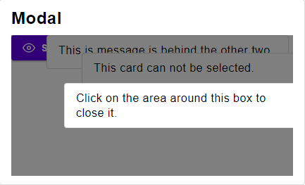
A modal showing a single element.
Material design only allows one element at a time to be viewed as a modal. To make things easier, this widget only views the first element of the list. This way you can see the list as a queue of modals.
import Element


type Msg
    = Close


Element.layout
    (singleModal
        [ { onDismiss = Just Close
          , content =
              Element.text "Click outside this window to close it."
          }
        ]
    )
    |> always "Ignore this line" --> "Ignore this line"
Technical Remark:
- To stop the screen from scrolling, set the height of the layout to the height of the screen.
Same implementation as singleModal but also displays the "queued" modals.
import Element


type Msg
    = Close


Element.layout
    (multiModal
        [ { onDismiss = Just Close
          , content =
              Element.text "Click outside this window to close it."
          }
        ]
    )
    |> always "Ignore this line" --> "Ignore this line"
Dialog
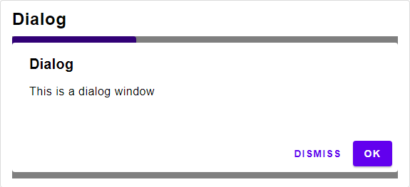
Dialog widget type
A Dialog Window.
import Widget.Material as Material
import Element


type Msg
    = Submit
    | Close


Element.layout
    (dialog (Material.alertDialog Material.defaultPalette)
        { title = Just "Accept"
        , text = "Are you sure?"
        , accept =
            { text = "Accept"
            , onPress = Just Submit
            }
            |> Just
        , dismiss =
            { text = "Cancel"
            , onPress = Just Close
            }
            |> Just
        }
        |> List.singleton
        |> singleModal
    )
    |> always "Ignore this line" --> "Ignore this line"
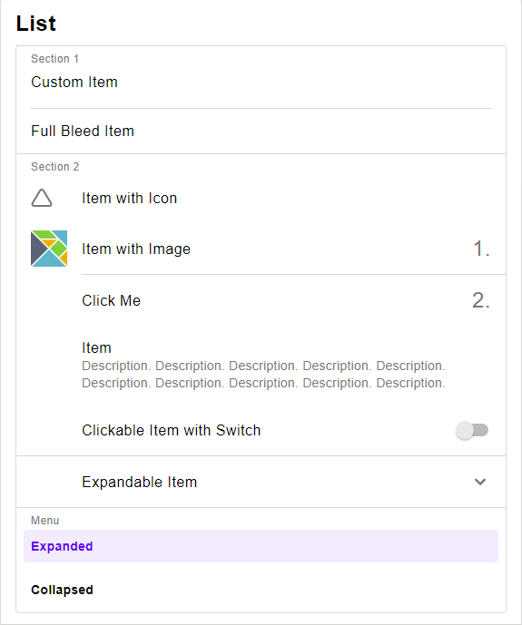
List
Row
Replacement of Element.row
import Element
import Widget.Material as Material


[ Element.text "Text 1"
, Element.text "Text 2"
]
    |> Widget.row Material.row
|> always "Ignore this line" --> "Ignore this line"A row of buttons
import Element
import Widget.Material as Material


type Msg =
    Select Int


selected : Maybe Int
selected =
    Just 0


Widget.select
    { selected = selected
    , options =
        [ 1, 2, 42 ]
            |> List.map
                (\int ->
                    { text = String.fromInt int
                    , icon = always Element.none
                    }
                )
    , onSelect = (\i -> Just (Select i ))
    }
    |> Widget.buttonRow
        { elementRow = Material.row
        , content = Material.toggleButton Material.defaultPalette
        }
    |> always "Ignore this line" --> "Ignore this line"
Column
Replacement of Element.column
import Element
import Widget.Material as Material


[ Element.text "Text 1"
, Element.text "Text 2"
]
    |> Widget.column Material.column
|> always "Ignore this line" --> "Ignore this line"A column of buttons
import Element
import Widget.Material as Material


type Msg =
    Select Int


selected : Maybe Int
selected =
    Just 0


Widget.select
    { selected = selected
    , options =
        [ 1, 2, 42 ]
            |> List.map
                (\int ->
                    { text = String.fromInt int
                    , icon = always Element.none
                    }
                )
    , onSelect = (\i -> Just (Select i ))
    }
    |> Widget.buttonColumn
        { elementColumn = Material.column
        , content = Material.toggleButton Material.defaultPalette
        }
    |> always "Ignore this line" --> "Ignore this line"
Item
Item widget type.
Use Widget.asItem if you want to turn a simple element into an item.
A text item spanning the full width.
import Element
import Widget.Material as Material


[ Widget.fullBleedItem (Material.fullBleedItem Material.defaultPalette)
    { onPress = Nothing
    , icon = always Element.none
    , text = "Item"
    }
, Widget.divider (Material.fullBleedDivider Material.defaultPalette )
, Widget.fullBleedItem (Material.fullBleedItem Material.defaultPalette)
    { onPress = Nothing
    , icon = always Element.none
    , text = "Item"
    }
]
    |> Widget.itemList (Material.cardColumn Material.defaultPalette)
|> always "Ignore this line" --> "Ignore this line"A clickable item that contains two spots for icons or additional information and a single line of text.
import Element
import Widget.Material as Material


[ Widget.insetItem (Material.insetItem Material.defaultPalette)
    { onPress = Nothing
    , icon = always Element.none
    , text = "Item"
    , content = always Element.none
    }
, Widget.divider (Material.insetDivider Material.defaultPalette )
, Widget.insetItem (Material.insetItem Material.defaultPalette)
    { onPress = Nothing
    , icon = always Element.none
    , text = "Item"
    , content = always Element.none
    }
]
    |> Widget.itemList (Material.cardColumn Material.defaultPalette)
|> always "Ignore this line" --> "Ignore this line"An expandable Item
import Element
import Widget.Material as Material


type Msg =
    Toggle Bool


let
    isExpanded : Bool
    isExpanded =
        True
in
(   ( Widget.fullBleedItem (Material.fullBleedItem Material.defaultPalette)
        { onPress = Nothing
        , icon = always Element.none
        , text = "Item with Icon"
        }
    )
    :: Widget.expansionItem (Material.expansionItem Material.defaultPalette )
        { onToggle = Toggle
        , isExpanded = isExpanded
        , icon = always Element.none
        , text = "Expandable Item"
        , content =
            [ Widget.fullBleedItem (Material.fullBleedItem Material.defaultPalette)
            { onPress = Nothing
            , icon = always Element.none
            , text = "Item with Icon"
            }
            ]
        }
)
    |> Widget.itemList (Material.cardColumn Material.defaultPalette)
|> always "Ignore this line" --> "Ignore this line"A clickable item that contains a image , a line of text and some additonal information
import Element
import Widget.Material as Material
import Widget.Material.Color as MaterialColor
import Element.Font as Font


[ Widget.imageItem (Material.imageItem Material.defaultPalette)
    { onPress = Nothing
    , image =
        Element.image [ Element.width <| Element.px <| 40, Element.height <| Element.px <| 40 ]
            { src = "https://upload.wikimedia.org/wikipedia/commons/thumb/f/f3/Elm_logo.svg/1024px-Elm_logo.svg.png"
            , description = "Elm logo"
            }
    , text = "Item with Image"
    , content =
        \{ size, color } ->
            "1."
                |> Element.text
                |> Element.el
                    [ Font.color <| MaterialColor.fromColor color
                    , Font.size size
                    ]
    }
]
    |> Widget.itemList (Material.cardColumn Material.defaultPalette)
|> always "Ignore this line" --> "Ignore this line"A item contining a text running over multiple lines.
import Element
import Widget.Material as Material


[ Widget.multiLineItem (Material.multiLineItem Material.defaultPalette)
    { title = "Title"
    , onPress = Nothing
    , icon = always Element.none
    , text = "Item"
    , content = always Element.none
    }
]
    |> Widget.itemList (Material.cardColumn Material.defaultPalette)
|> always "Ignore this line" --> "Ignore this line"A header for a part of a list.
import Element
import Widget.Material as Material


[ Widget.fullBleedItem (Material.fullBleedItem Material.defaultPalette)
    { onPress = Nothing
    , icon = always Element.none
    , text = "Item"
    }
, "Header"
    |> Widget.headerItem (Material.insetHeader Material.defaultPalette )
, Widget.fullBleedItem (Material.fullBleedItem Material.defaultPalette)
    { onPress = Nothing
    , icon = always Element.none
    , text = "Item"
    }
]
    |> Widget.itemList (Material.cardColumn Material.defaultPalette)
|> always "Ignore this line" --> "Ignore this line"A divider.
import Element
import Widget.Material as Material


[ Widget.fullBleedItem (Material.fullBleedItem Material.defaultPalette)
    { onPress = Nothing
    , icon = always Element.none
    , text = "Item"
    }
, Widget.divider (Material.insetDivider Material.defaultPalette )
, Widget.fullBleedItem (Material.fullBleedItem Material.defaultPalette)
    { onPress = Nothing
    , icon = always Element.none
    , text = "Item"
    }
]
    |> Widget.itemList (Material.cardColumn Material.defaultPalette)
|> always "Ignore this line" --> "Ignore this line"Displays a selection of Buttons as a item list. This is intended to be used as a menu.
import Element
import Widget.Material as Material


type Msg =
    Select Int


(   { selected = Just 1
    , options =
        [ "Option 1", "Option 2" ]
            |> List.map
                (\text ->
                    { text = text
                    , icon = always Element.none
                    }
                )
    , onSelect = (\int ->
        int
        |> Select
        |> Just
        )
    }
        |> Widget.selectItem (Material.selectItem Material.defaultPalette)
)
    |> Widget.itemList (Material.cardColumn Material.defaultPalette)
|> always "Ignore this line" --> "Ignore this line"Turns a Element into an item. Only use if you want to take care of the styling yourself.
import Element
import Widget.Material as Material


Element.text "Just a text"
    |> Widget.asItem
    |> List.singleton
    |> Widget.itemList (Material.cardColumn Material.defaultPalette)
|> always "Ignore this line" --> "Ignore this line"Implementation of the Material design list
import Element
import Widget.Material as Material


[ Widget.fullBleedItem (Material.fullBleedItem Material.defaultPalette)
    { onPress = Nothing
    , icon = always Element.none
    , text = "Item"
    }
, "Header"
    |> Widget.headerItem (Material.insetHeader Material.defaultPalette )
, Widget.fullBleedItem (Material.fullBleedItem Material.defaultPalette)
    { onPress = Nothing
    , icon = always Element.none
    , text = "Item"
    }
]
    |> Widget.itemList (Material.cardColumn Material.defaultPalette)
    |> always "Ignore this line" --> "Ignore this line"
App Bar
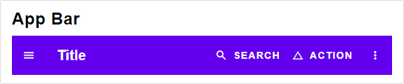
A app bar with tabs instead of a menu.
This is should be used for big screens.
It should be avoided for smaller screens or if you have more then 4 tabs
import Element exposing (DeviceClass(..))
import Widget.Material as Material


type Msg =
    Select Int


selected : Int
selected = 0


Widget.tabBar style.tabBar
    { title =
        "Title"
            |> Element.text
            |> Element.el Typography.h6
    , menu =
        { selected = Just selected
        , options =
            [ "Home", "About" ]
                |> List.map
                    (\string ->
                        { text = string
                        , icon = always Element.none
                        }
                    )
        , onSelect = \int -> int |> Select |> Just
        }
    , deviceClass = Phone
    , openRightSheet = Nothing
    , openTopSheet = Nothing
    , primaryActions =
        [   { icon =
                Material.Icons.change_history
                    |> Icon.elmMaterialIcons Color
            , text = "Action"
            , onPress = Nothing
            }
        ]
    , search = Nothing
    }
Sort Table
Technical Remark:
- If icons are defined in Svg, they might not display correctly.
To avoid that, make sure to wrap them in
Element.html >> Element.el []
Sort Table widget type
Column for the Sort Table widget type
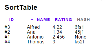
A table where the rows can be sorted by columns
import Widget.Material as Material
import Element


type Msg =
    ChangedSorting String


sortBy : String
sortBy =
    "Id"


asc : Bool
asc =
    True


Widget.sortTable (Material.sortTable Material.defaultPalette)
    { content =
        [ { id = 1, name = "Antonio", rating = 2.456, hash = Nothing }
        , { id = 2, name = "Ana", rating = 1.34, hash = Just "45jf" }
        , { id = 3, name = "Alfred", rating = 4.22, hash = Just "6fs1" }
        , { id = 4, name = "Thomas", rating = 3, hash = Just "k52f" }
        ]
    , columns =
        [ Widget.intColumn
            { title = "Id"
            , value = .id
            , toString = \int -> "#" ++ String.fromInt int
            , width = Element.fill
            }
        , Widget.stringColumn
            { title = "Name"
            , value = .name
            , toString = identity
            , width = Element.fill
            }
        , Widget.floatColumn
            { title = "Rating"
            , value = .rating
            , toString = String.fromFloat
            , width = Element.fill
            }
        , Widget.unsortableColumn
            { title = "Hash"
            , toString = (\{hash} -> hash |> Maybe.withDefault "None")
            , width = Element.fill
            }
        ]
    , asc = asc
    , sortBy = sortBy
    , onChange = ChangedSorting
    }
|> always "Ignore this line" --> "Ignore this line"A Column containing a Float
A Column containing a Int
A Column containing a String
value >> toString field will be used for displaying the content.
value will be used for comparing the content
For example value = String.toLower will make the sorting case-insensitive.
An unsortable Column, when trying to sort by this column, nothing will change.
Text Input
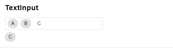
Text Input widget type
A text Input that allows to include chips.
import Element
import Widget.Material as Material


type Msg =
    ToggleTextInputChip String
    | SetTextInput String


{text = "Hello World"}
    |> (\model ->
            { chips =
                [ "Cat", "Fish", "Dog"]
                    |> List.map
                        (\string ->
                            { icon = always Element.none
                            , text = string
                            , onPress =
                                string
                                    |> ToggleTextInputChip
                                    |> Just
                            }
                        )
            , text = model.text
            , placeholder = Nothing
            , label = "Chips"
            , onChange = SetTextInput
            }
        )
    |> Widget.textInput (Material.textInput Material.defaultPalette)
    |> always "Ignore this line" --> "Ignore this line"
Tab
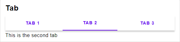
Tab widget type
Displayes a list of contents in a tab
import Element
import Widget.Material as Material


type Msg =
    ChangedTab Int


selected : Maybe Int
selected =
    Just 0


Widget.tab (Material.tab Material.defaultPalette)
    { tabs =
        { selected = selected
        , options =
            [ 1, 2, 3 ]
                |> List.map
                    (\int ->
                        { text = "Tab " ++ (int |> String.fromInt)
                        , icon = always Element.none
                        }
                    )
        , onSelect =
            (\s ->
                if s >= 0 && s <= 2 then
                    Just (ChangedTab s)
                else
                    Nothing
            )
        }
    , content =
        (\s ->
            case s of
                Just 0 ->
                    "This is Tab 1" |> Element.text
                Just 1 ->
                    "This is the second tab" |> Element.text
                Just 2 ->
                    "The thrid and last tab" |> Element.text
                _ ->
                    "Please select a tab" |> Element.text
        )
    }
    |> always "Ignore this line" --> "Ignore this line"
Progress Indicator
Progress Indicator widget type
If maybeProgress is set to Nothing, an indeterminate progress indicator (e.g. spinner) will display.
If maybeProgress is set to Just Float (where the Float is proportion of completeness between 0 and 1 inclusive), a determinate progress indicator will visualize the progress.
Displays a circular progress indicator
import Widget.Material as Material


Just 0.75
|> Widget.circularProgressIndicator (Material.progressIndicator Material.defaultPalette)
|> always "Ignore this line" --> "Ignore this line"