Animator.Css
Animate with CSS keyframes.
This can be a very performant because
CSS animations are executed efficiently by the browser.
We only have to ask for one
AnimationFramefrom the browser when an animation starts and we can render the entire animation.
This means Elm only needs to run your view code once instead of 60 times a second.
Elm is generally pretty fast and efficient at all this! But it can be even faster to skip the work altogether.
This is a single div element.
It's just like a normal Html node, except it also takes a Timeline and a list of attributes you want to animate.
Here's a checkbox that changes backgrounds as a brief example:
Animator.Css.div model.checked
    [ Animator.Css.backgroundColor <|
        \checked ->
            if checked then
                Color.rgb255 255 96 96


            else
                Color.white
    ]
    [ Attr.style "height" "30px"
    , Attr.style "width" "30px"
    ]
[ Html.text "" ]Specify a node name that's not a div. Here's an <a>.
Animator.Css.node "a"
    model.checked
    [ Animator.Css.backgroundColor <|
        \checked ->
            if checked then
                Color.rgb255 255 96 96


            else
                Color.white
    ]
    [ Attr.style "height" "30px"
    , Attr.style "width" "30px"
    ]
    [ Html.text "" ]
Properties
Text
Background
Border
Custom
Note on Shadows and Filters - You might be wondering why there is no box-shadow or filter.
They're not supported first class because they're expensive by default.
If you're trying to animate a box-shadow, your best bet is to render the box shadow once in a separate element, and then only animate opacity on that element.
Basically you want to recreate what is described in this overview.
Transform
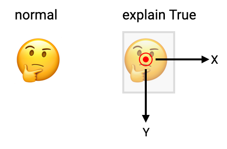
This is a debug tool for transformations.
If you turn this on, it will show you:
A grey bounding box so you get a sense of the element you're animating.
A red dot at the center of the element. Any rotation will be around this point.
You can adjust the dot's position using
transformWithand setting a new origin.The coordinate axes. Yes, in CSS, y points down.
This represents moving something around in 3d.
This includes:
- scaling
- changing position
- rotation
Animator.Css.transform <|
    \state ->
        case state of
            Stationary ->
                Animator.Css.xy
                    { x = 0
                    , y = 0
                    }


            Rotating ->
                -- do a full rotation every 5 seconds
                Animator.Css.rotating
                    (Animator.seconds 5)
Note - If you're doing 3d transformations, you should set a CSS perspective property either on this element or on a parent. If it's on a parent, then all elements will share a common perspective origin.
So, add something like this to the parent element:
perspective: 500px;
perspective-origin: center;Rotate to a specific angle, where increasing numbers move clockwise.
The actual number provided should be in Elm standard angles (radians).
Alternatively you could use turns or degrees instead.
Have this element "look at" a specifc point.
The coordinates provided are relative to this element.
The default, which is where the element is looking directly outwards from the screen, is:
Animator.Css.lookAt
    { x = 0
    , y = 0
    , z = 1
}Transform Options
The origin for rotation. Defaults to the center of the element.
This is the x and y offset, in pixels from the center of the object.
Generally I found the most common case for adjusting the origin was when you want it mostly centered, but aligned to the visual center of an icon or image, which is offset by a number of pixels.
Advanced
Note - One of the difficulties in making an animation library for CSS is that operations such as translate and rotate need to be rendered as one property called transform.
While normally this isn't that big of a deal, one consequence for generating CSS keyframes is that all resting states for all transformations need to share the same period.
Because of that, in2d and in3d are constructed a little differently instead of just using Movement like everything else.
Note - Again, because of the CSS characteristic mentioned above, we have to have once and repeat defined separetely from Animator.once for the special case of transforms.
Animator.Css.watchingis different fromAnimator.watchingin that it will only ask for one frame when an animation is updated.In that one frame, we render the entire CSS animation, which can run without
Elmneeding to do a full rerender.