Element
Basic Elements
Standard attribute which cannot be a decoration.
Nothing to see here!
Create some plain text.
text "Hello, you stylish developer!"Note text does not wrap by default. In order to get text to wrap, check out paragraph!
The basic building block of your layout.
import Color exposing (blue, darkBlue)
import Element exposing (Element)
import Element.Background as Background
import Element.Border as Border


myElement : Element msg
myElement =
    Element.el
        [ Background.color blue
        , Border.color darkBlue
        ]
        (Element.text "You've made a stylish element!")
Rows and Columns
Rows and columns are the most common layouts.
If you want a row of elements, use row!
Text Layout
Text needs it's own layout primitives.
A paragraph will layout all children as wrapped, inline elements.
import Element
import Element.Font as Font


Element.paragraph []
    [ text "lots of text ...."
    , el [ Font.bold ] (text "this is bold")
    , text "lots of text ...."
    ]
This is really useful when you want to markup text by having some parts be bold, or some be links, or whatever you so desire.
Also, if a child element has alignLeft or alignRight, then it will be moved to that side and the text will flow around it, (ah yes, float behavior).
This makes it particularly easy to do something like a dropped capital.
import Element
import Element.Font as Font


Element.paragraph []
    [ el
        [ alignLeft
        , padding 5
        , Font.lineHeight 1
        ]
        (text "S")
    , text "lots of text ...."
    ]
Which will look something like

Now that we have a paragraph, we need someway to attach a bunch of paragraph's together.
To do that we can use a textColumn.
The main difference between a column and a textColumn is that textColumn will flow the text around elements that have alignRight or alignLeft, just like we just saw with paragraph.
In the following example, we have a textColumn where one child has alignLeft.
Element.textColumn [ spacing 10, padding 10 ]
    [ paragraph [] [ text "lots of text ...." ]
    , el [ alignLeft ] empty
    , paragraph [] [ text "lots of text ...." ]
    ]
Which will result in something like:

Data Table
Show some tabular data.
Start with a list of records and specify how each column should be rendered.
So, if we have a list of persons:
type alias Person =
    { firstName : String
    , lastName : String
    }


persons : List Person
persons =
    [ { firstName = "David"
      , lastName = "Bowie"
      }
    , { firstName = "Florence"
      , lastName = "Welch"
      }
    ]
We could render it using
Element.table []
    { data = persons
    , columns =
        [ { header = Element.text "First Name"
          , view =
                (\person ->
                    Element.text person.firstName
                )
          }
        , { header = Element.text "Last Name"
          , view =
                 (\person ->
                    Element.text person.lastName
                 )
          }
        ]
    }
Note: Sometimes you might not have a list of records directly in your model. In this case it can be really nice to write a function that transforms some part of your model into a list of records before feeding it into Element.table.
Same as Element.table except the view for each column will also receive the row index as well as the record.
Rendering
This is your top level node where you can turn Element into Html.
Style elements embeds two StyleSheets, one that is constant, and one that changes dynamically based on styles collected from the elments being rendered.
This option will stop the static/constant stylesheet from rendering.
Make sure to render the constant/static stylesheet at least once on your page!
Any hover styles, aka attributes with mouseOver in the name, will be always turned on.
This is useful for when you're targeting a platform that has no mouse, such as mobile.
Disable all mouseOver styles.
Links and Images
link []
    { url = "google.com"
    , label = text "My Link to Google"
}A link to download a file.
A link to download a file, but you can specify the filename.
Both a source and a description are required for images. The description is used to describe the image to screen readers.
If an image is purely decorative, you can skip the caption.
Attributes
Standard attribute which cannot be a decoration.
Make an element transparent and have it ignore any mouse or touch events, though it will stil take up space.
A capped value between 0.0 and 1.0, where 0.0 is transparent and 1.0 is fully opaque.
Semantically equavalent to html opacity.
Set the cursor to the pointer hand.
Shrink to an element to fit it's contents.
Fill the available space. The available space will be split evenly between elements that have width fill.
Sometimes you may not want to split available space evenly. In this case you can use fillPortion to define which elements should have what portion of the available space.
So, two elements, one with width (fillPortion 2) and one with width (fillPortion 3). The first would get 2 portions of the available space, while the second would get 3.
Also: fill == fillPortion 1
Fill the available space as long as it's between the pixel bounds.
Padding and Spacing
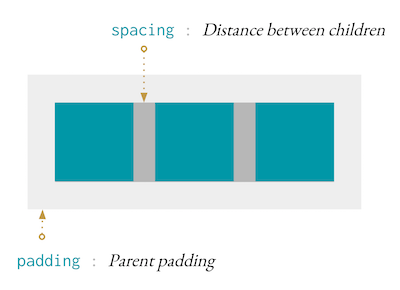
There's no concept of margin in style-elements, instead we have padding and spacing.
Padding is what you'd expect, the distance between the outer edge and the content, and spacing is the space between children.
So, if we have the following row, with some padding and spacing.
Element.row [ padding 10, spacing 7 ]
    [ Element.el [] empty
    , Element.el [] empty
    , Element.el [] empty
    ]
Here's what we can expect.
Set horizontal and vertical padding.
In the majority of cases you'll just need to use spacing, which will work as intended.
However for some layouts, like textColumn, you may want to set a different spacing for the x axis compared to the y axis.
Alignment
Alignment can be used to align an Element within another Element.
Element.el [ centerX, alignTop ] (text "I'm centered and aligned top!")If alignment is set on elements in a layout such as row, then the element will push the other elements in that direction. Here's an example.
Element.row []
    [ Element.el [] Element.empty
    , Element.el [ alignLeft ] Element.empty
    , Element.el [ centerX ] Element.empty
    , Element.el [ alignRight ] Element.empty
    ]
will result in a layout like
|-|-| |-| |-|Where there are two elements on the left, one in the center, and on on the right.
Nearby Elements
Let's say we want a dropdown menu. Essentially we want to say: put this element below this other element, but don't affect the layout when you do.
Elemenet.row []
    [ Element.el
        [ Element.below True (Element.text "I'm below!")
        ]
        (Element.text "I'm normal!")
    ]
This will result in
|- I'm normal! -|
   I'm below
Where "I'm Below" doesn't change the size of Element.row.
This is very useful for things like dropdown menus or tooltips.
Temporary Styling
This is a special attribute that counts as both a Attribute msg and a Decoration.
Only decorations
Adjustment
Clipping and Scrollbars
Clip the content if it overflows.
If these are present, the element will add a scrollbar if necessary.
Responsiveness
Takes in a Window.Size and returns a device profile which can be used for responsiveness.
Scaling
When designing it's nice to use a modular scale to set spacial rythms. scaled = Scale.modular 16 1.25
A modular scale starts with a number, and multiplies it by a ratio a number of times. Then, when setting font sizes you can use:
   Font.size (scaled 1) -- results in 16


   Font.size (scaled 2) -- 16 * 1.25 results in 20


   Font.size (scaled 4) -- 16 * 1.25 ^ (4 - 1) results in 31.25
We can also provide negative numbers to scale below 16px.
Font.size (scaled -1) -- 16 * 1.25 ^ (-1) results in 12.8
The basic building block of your layout. Here we create a