Elm Bootstrap Gallery

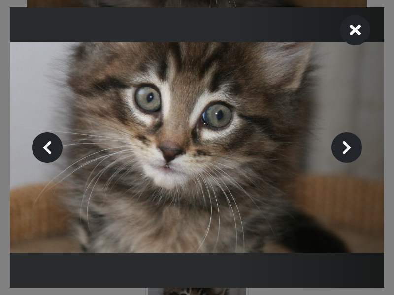
This package allows you to pop-open a model gallery for flipping through images or displaying a single image in a lightbox.
It uses style animations to fade the modal in & out and to fade between images. Clickable elements allow viewers to scroll through images or dismiss the modal.
The CSS classes used in the rendering function tie this to Bootstrap v4. FontAwesome is used for the Next, Previous, & Close icons. In the future, this may be made more customizable and CSS-framework agnostic(Pull Requests welcome!).
We try to leverage as many Bootstrap classes as possible, but some manual styles are still required for proper rendering of the modal. One day these might be transferred into inline-styles while maintaining the ability to customize the styling.
It was originally developed for the Foundation for Intentional Community's Wordpress Theme and was extracted from that repository for use in Southern Exposure's Website.
There is an example application included in the repository.
Usage
Start by importing the BootstrapGallery module:
import BootstrapGallery as GalleryNow build a Config a type for your image type. E.g., if you have a type like:
type alias ImageData =
    { thumbnail : String
    , original : String
    }
Then your Config ImageData would look like:
galleryConfig : Gallery.Config ImageData
galleryConfig =
    { thumbnailUrl = .thumbnail >> Just
    , imageUrl = .original
    }
If the thumbnailUrl function returns a Nothing, the imageUrl will be used
for any thumbnails.
Next add the Gallery state to your Model:
type alias Model =
    { gallery : Gallery.Model ImageData
    , images : List ImageData
    }

initialModel : Model
initialModel =
    { gallery = Gallery.initial
    , images = [imageOne, imageTwo]
    }
You'll also need to add a value to your Msg type for wrapping the
Gallery.Msg ImageData messages, as well as a subscription & update branch:
type Msg
    = GalleryMsg (Gallery.Msg ImageData)

subscriptions : Model -> Sub Msg
subscriptions model =
    Sub.map GalleryMsg (Gallery.subscriptions model.gallery)

update msg model =
    case msg of
        GalleryMsg subMsg ->
            ( Gallery.update galleryConfig subMsg model.gallery model.images
            , Cmd.none
            )
            |> Tuple.mapFirst (\gallery -> { model | gallery = gallery })
Finally you can render the modal. Use the thumbnails function to render a
grid of thumbnails, or use the openOnClick attribute to hook up existing
images:
view : Model -> Html Msg
view model =
    div []
        [ Gallery.thumbnails galleryConfig model.images
            |> Html.map GalleryMsg
        , Gallery.modal model.gallery
            |> Html.map GalleryMsg
        ]
Note that this won't make the modal useable. You will need to define some additional CSS styles for the modal. See the example application's styles for inspiration.
Contribute
Contributions, feature requests, & bug reports are always welcome!
There is an .nvmrc & package.json in this directory, so you can run nvm
use && npm i to get all the development tools installed.
Run npm run serve to build, watch, & serve the example application at
http://localhost:8000.
Run npx elm-analyse -s to launch a server at http://localhost:8001 for
linting the code and npm run docs to launch a server at http://localhost:8002
for previewing the documentation.
TODO
These are things that weren't necessary for the FIC or SESE modals, but would be nice for other library consumers:
- Store list in model? Currently don't have it so thumbnails & next/prev could have different sets of images.
- Dim current & show spinner while waiting for next/prev image to load * Do we stack the current and next image on top of each other, with a spinner in between?
- Esc & arrow keys to close/navigate * It seems like this'd require subscriptions to ports that bind the onkeyup events to the document. Which means some documentation & example code for eventual package. * Or maybe we could focus part of the modal when it opens so we can catch events on there?
- Allow showing row of thumbnails below image or bottom of screen.
- Reduce need for an external stylesheet. Maybe bundle this with more configuration options for how to render the Modal.
License
BSD-3-Clause, exceptions possible.