R10.Button
Buttons!
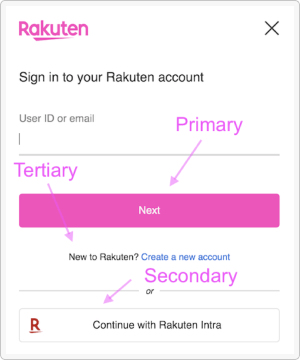
Secondary Button
tertiary :
List (Attribute msg)
-> { label : Element msg
, libu : Type msg
, theme : Theme
}
-> Element msg
Tertiary Button
Quaternary Button
Others
Type of data required by buttons
Special case for CSS buttons, useful if a button must be built using the standard Html library instead of elm-ui.
Default padding value for buttons
Attributes for buttons with limited width. By default buttons are width fill.
Modules
- R10.Button
- R10.Card
- R10.Color
- R10.Counter
- R10.Country
- R10.DropDown
- R10.FontSize
- R10.Footer
- R10.Form
- R10.FormDebug
- R10.FormTypes
- R10.Header
- R10.I18n
- R10.Language
- R10.LanguageSelector
- R10.Libu
- R10.Link
- R10.Mode
- R10.Okaimonopanda
- R10.Paragraph
- R10.SimpleMarkdown
- R10.Table
- R10.Theme
- R10.Translations
- R10.Color.AttrsBackground
- R10.Color.AttrsBorder
- R10.Color.AttrsFont
- R10.Color.Svg
- R10.Color.Utils
- R10.Svg.Icons
- R10.Svg.IconsExtra
- R10.Svg.Lists
- R10.Svg.Logos
- R10.Svg.LogosExtra
- R10.Svg.Others
- R10.Svg.Utils
Primary Button for Call to Actions