Widget.Material
This module implements a Material design theme for all widgets.
The stylings are following the official Material Design guidelines as close as possible. Please use these widgets in combination with the official guidelines.
The typography is taken from the Material Design guidelines. Its recommended to use a font size of 16px width and the Roboto Font.
The style are not opaque, so you can change every styling to your needs.
If you have any suggestions or improvements, be sure to leave a PR or a Issue over at the github repos.
Palette
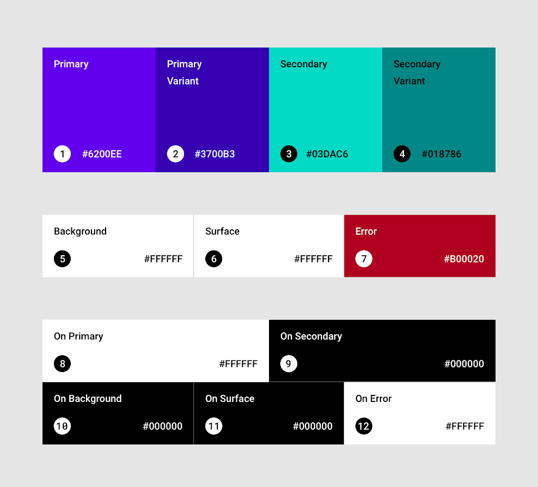
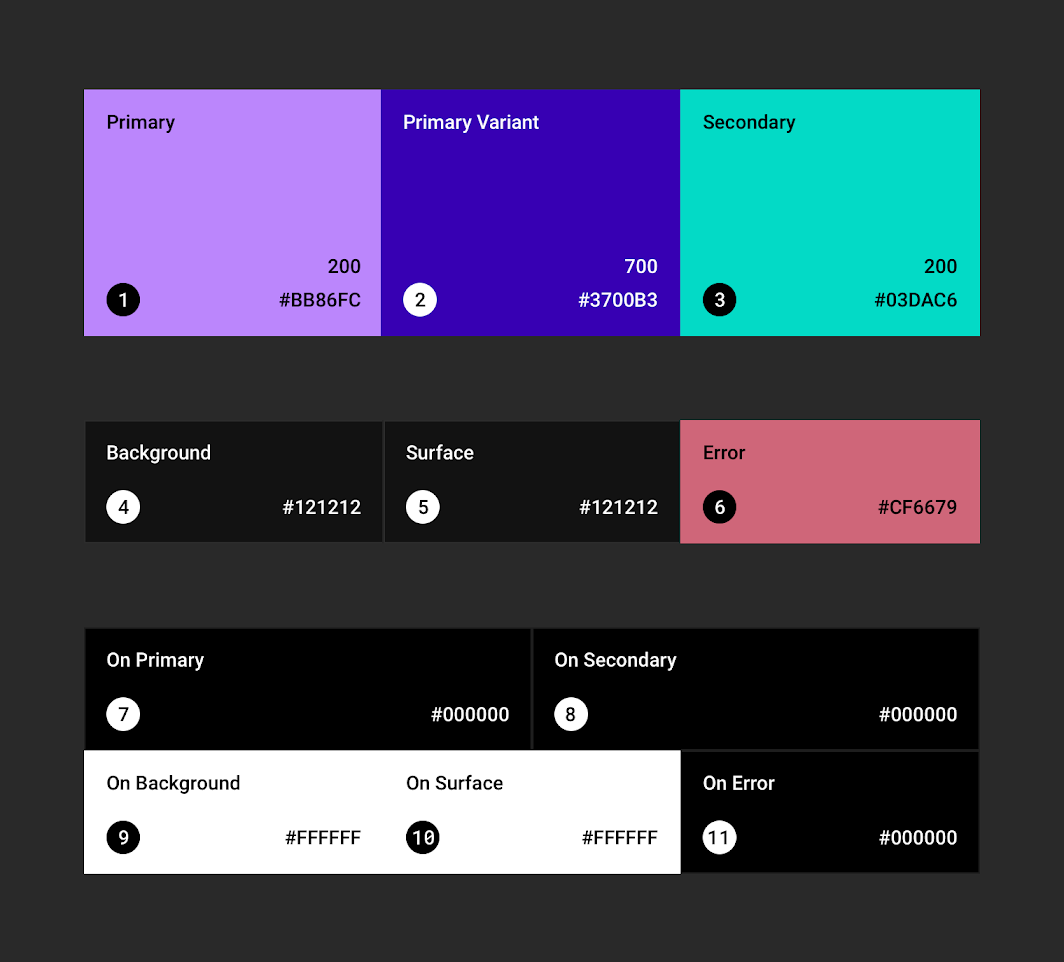
Swaps the primary and secondary color.
Why is this needed? See the material design specification for details.
generates a "grayish 50%" color that matches the on-surface color.
generates a "grayish 14%" color that matches the on-surface color.
generates a grayer text color
Button
Different styles for buttons have different meanings.
- Use
textButtonas your default button - Use
containedButtonfor any important action - Use
outlinedButtonif you have more then one important action. UsecontainedButtonfor the most important action of the group.
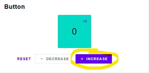
A contained button representing the most important action of a group.
A outlined button representing an important action within a group.
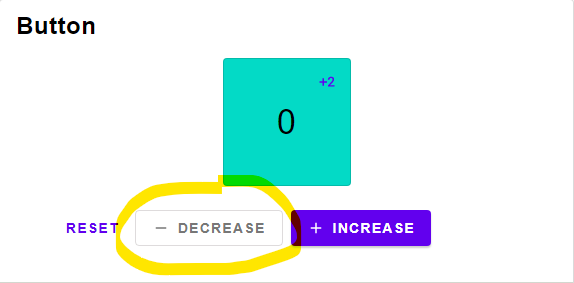
A text button representing a simple action within a group.
An single selectable icon.
Technical Remark:
- Could not find any specification details
A ToggleButton. Only use as a group in combination with buttonRow.
Toggle buttons should only be used with the iconButton widget, else use chips instead.

Technical Remark:
- Border color was not defined in the specification
- There are two different versions, one where the selected color is gray and another where the color is primary. I noticed the gray version was used more often, so i went with that one.
a Row of buttons.
Only use in combination with toggleButton

Switch
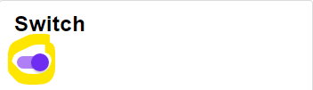
A boolean switch
Technical Remark:
- The specification states that the disabled switch should have a color dependent on its activeness. This is not implemented.
Card
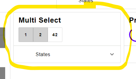
A List styled like a card.
Technical Remark:
This is a simplification of the Material Design Card and might get replaced at a later date.
A variant of cardColumn designed for a single item.
Use this with a normal Element.column, Element.row or even a Element.el.
Chip
Chips have the same behavior as buttons but are visually less important.
In the official documentation chips have different names depending on where they are used:
- Input Chips are used inside a text field. Use
textInputfor this feature. - Choice Chips are used for selecting an option.
The material design guidelines recommend using
toggleButtonfor icons with no text and chips for text with no icons. - Filter Chips are used for selecting multiple options. They typically have a done-icon when selected.
- Action chips are like button. Make sure to include an icon when using action chips.
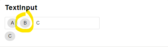
Technical Remark:
- Decided against the implementation of an outlined chip. Please open a new issue or a PR if you want to have it implemented.
A variant of textInput designed for Input.text.
A text input style that is included only to support input chips.
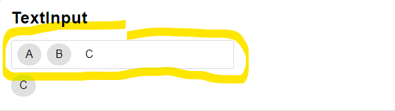
Technical Remark:
- This is just a temporary implementation. It will soon be replaced with the official implementation.
A text input style for the password Input.
Dialog
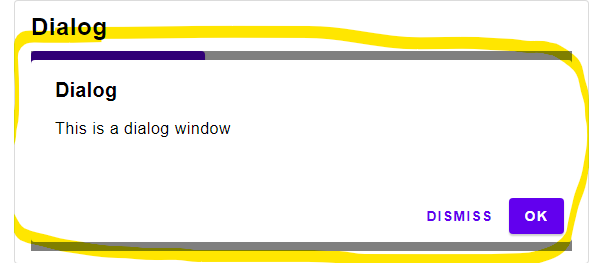
An alert dialog for important decisions. Use a snackbar for less important notification.
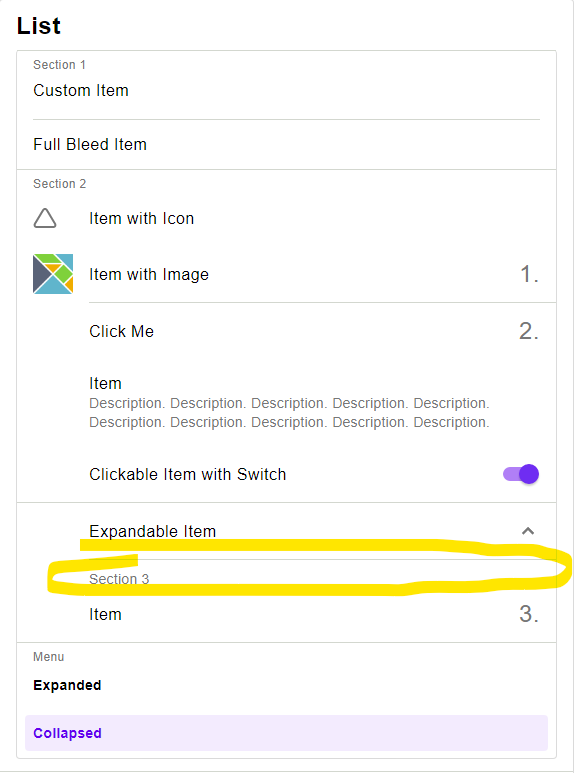
List
A simple styling for a row.
A simple styling for a column.
App Bar
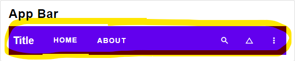
An app bar with a menu on the left side
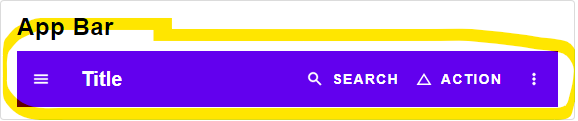
An app bar with tabs instead of a menu
Sheet
A side sheet. Has a maximal width of 360.
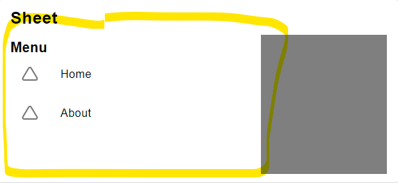
A bottom sheet. Has a maximal width of 360. Should be align to the bottom right corner of the screen.
Item
A List is build from items. You way want to use special items to visually organize the content of your list.
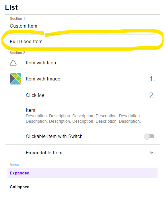
A basic item containing some text, a button. Spans the full width.
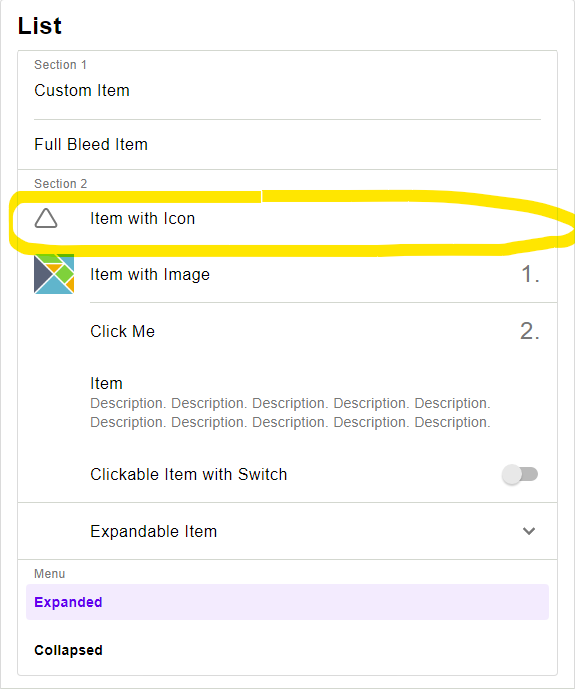
A basic item containing some text, a button and some additional information.
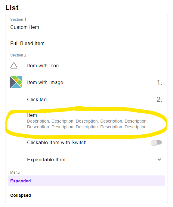
A text item allowing for more text.
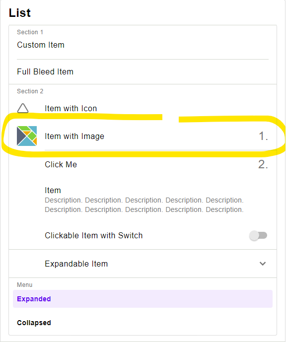
Similar to a textItem but with an image instead of the icon.
If the image is bigger then 40x40, the size of the item will change.
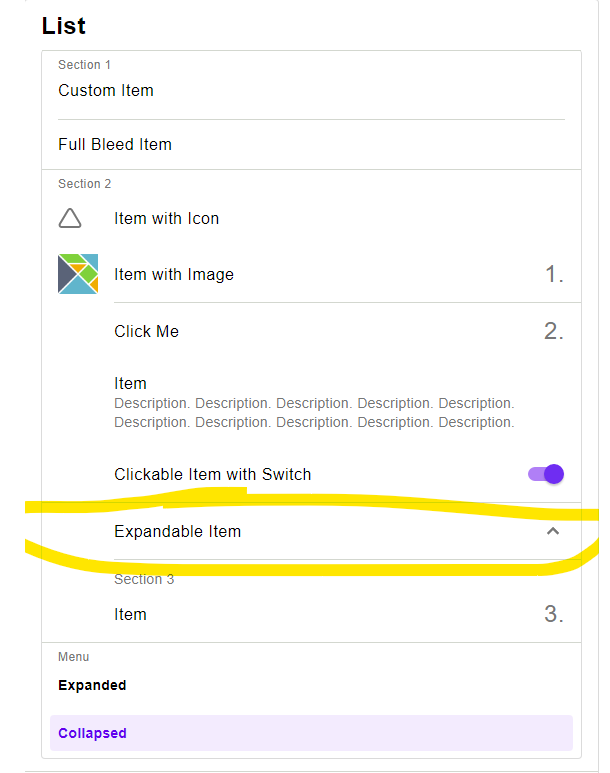
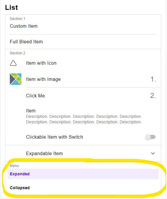
Displays a selection. This should be combined with Widget.selectItem
A divider covering the full length
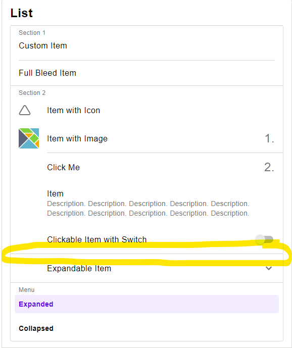
A divider covering only parts of the width
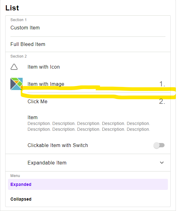
A divider in the center
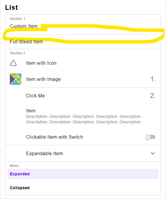
A header of a section of a list. Comes with a full bleed divider.
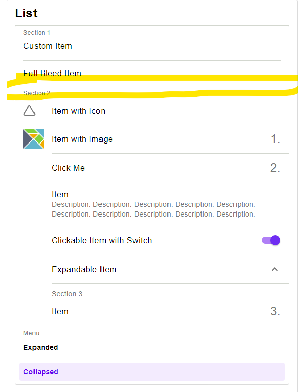
A header of a section of a list. Comes with a inset divider.
Progress Indicator
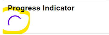
A circular progress indicator
Sort Table
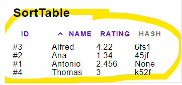
A sortable table
Snackbar
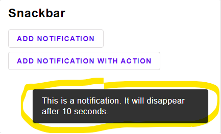
A typical snackbar
Technical Remark:
- The text color of the button was not given in the specification. This implementation adjusts the luminance of the color to fit the w3 accessability standard
Tab
A Tab bar meant for only the upper most level. Do not use a tab within a tab.
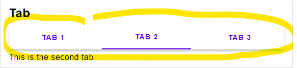
A single Tab button.
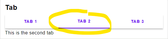
Technical Remark:
- The official specification states that the background color should be the surface color, but the pictures and actual implementations all have no background color. So here the background color is also not set.
DEPRECATED
DEPRECATED
Use Material.toggleRow instead
The material design comes with customizable color palettes.
Check out the official documentation about the color system to see how these colors are used.
For the
-oncolors you can use white, for transitions into white, or black,for transitions into black. Other colors are also possible, but i've not seen any website actually using a different color.