Evg
Draw pictures with shapes, text, and effects, using a friendly, type-safe API.
You describe a picture as a list of shapes, and the library renders it in the
browser as crisp vector graphics that stay sharp at any size. Positions are
plain numbers: (0, 0) is the top-left corner, x grows to the right, and
y grows downward.
import Evg exposing (Evg)


scene : Html msg
scene =
    Evg.svg []
        { width = 200, height = 200 }
        [ Evg.circle
            [ Evg.fillStr "tomato" ]
            { r = 60, center = ( 100, 100 ) }
        , Evg.line
            [ Evg.strokeStr "navy" ]
            ( 20, 20 )
            ( 180, 180 )
        ]
This draws a tomato-colored circle in the middle of a 200 by 200 canvas, with a navy diagonal line crossing it.
Each shape takes a list of attributes (colors, outlines, effects) followed by
the measurements that define it. The type system checks that every attribute
makes sense for the shape it is applied to. For example, cornerRadius is
accepted on a rectangle but rejected on a circle at compile time.
Core Types
A setting applied to a shape, such as its color, outline, or an effect.
The constraints type parameter records which shapes an attribute makes sense
on, so mistakes are caught when compiling. For example, cornerRadius only
applies to rectangles, and the compiler will tell you if you put it on a
circle.
A marker that appears in the constraints of an Attribute.
You only need it when writing your own type annotations for attribute lists,
for example a helper producing attributes that work on any shape with a fill:
fancyFill :
    List
        (Evg.Attribute
            { a | fill : Evg.Supported }
            msg
)An image effect that can be applied to a shape, like a blur or a drop
shadow. Built with the Evg.Filter module and applied with
filter.
Coordinate Spaces
Decides which coordinates an effect (a gradient, pattern, clip path, or mask) is measured in.
Most of the time you don't need to think about this, because the default
functions pick a sensible option. The *WithCoordinates variants let you
choose explicitly, and there are two choices:
Object bounding box coordinates are measured against the shape being painted.
(0, 0) means the shape's own top-left corner and (1, 1) its bottom-right,
no matter where the shape is or how big it is. Use this for effects that
should stretch with the shape, like "fade from left edge to right edge".
User space coordinates are the same plain numbers you position shapes with. Use this for effects that should stay fixed in the picture no matter which shape they are applied to, like one large gradient shared by several bars of a chart.
Coordinates measured against the shape being painted, where (0, 0) is
its top-left corner and (1, 1) its bottom-right. The rect says which part
of the shape the effect covers. Usually you want all of it:
-- A gradient spanning the whole shape:
Evg.objectBoundingBox
{ x = 0, y = 0, width = 1, height = 1 }Coordinates in the same units you position shapes with. The rect says which region of the picture the effect covers.
-- A gradient pinned to a specific area:
Evg.userSpace
    { x = 0, y = 0, width = 200, height = 100 }
Rendering
Creates the drawing canvas. All shapes go inside here, and the result is
ordinary Html you can place anywhere in your view.
The width and height set both the size on screen (in pixels) and the
coordinate system: child coordinates run from (0, 0) at the top-left to
(width, height) at the bottom-right. If CSS later stretches or shrinks the
element, your coordinates keep working; the drawing scales as one piece.
Evg.svg []
    { width = 300, height = 200 }
    [ Evg.circle
        [ Evg.fillStr "red" ]
        { r = 50, center = ( 150, 100 ) }
    ]
Document Structure
Collects several shapes into one, so you can treat them as a unit. An
attribute placed on the group applies to everything inside: fade them all out
with one opacity, move them together with one transform, or listen for
clicks on any of them with one event handler.
-- Two overlapping squares, both at half opacity:
Evg.group [ Evg.opacity 0.5 ]
    [ Evg.rect
        [ Evg.fillStr "blue" ]
        { x = 0
        , y = 0
        , width = 100
        , height = 100
        }
    , Evg.rect
        [ Evg.fillStr "red" ]
        { x = 50
        , y = 50
        , width = 100
        , height = 100
        }
    ]
Groups are also handy for structuring a drawing the way you'd structure code, with one function returning the group for each part of the picture.
Basic Shapes
Draws a straight line from one point to another.
A line has no inside to fill, only a stroke (the visible ink drawn along it). If you don't pick a stroke color, you get a thin black line.
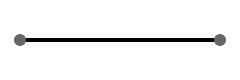
Evg.line [] ( 10, 20 ) ( 110, 20 )


-- A thicker red diagonal:
Evg.line
    [ Evg.strokeStr "red", Evg.strokeWidth 3 ]
    ( 0, 0 )
( 100, 100 )Draws a rectangle. The x and y give its top-left corner, and width
and height extend it rightward and downward from there. Without a fill
color it comes out solid black.

Evg.rect
    [ Evg.fillStr "navy" ]
    { x = 10, y = 10, width = 100, height = 100 }


-- With rounded corners:
Evg.rect [ Evg.fillStr "navy", Evg.cornerRadius 10 ]
{ x = 10, y = 10, width = 100, height = 100 }Draws a circle. You give the center point and the radius r (the
distance from the center to the edge).

Evg.circle
    [ Evg.fillStr "crimson" ]
{ r = 40, center = ( 50, 50 ) }Draws an ellipse (an oval): like a circle, but with separate radii for
each direction. rx is the distance from the center to the left and right
edges, ry to the top and bottom. A wide rx with a small ry gives a
flattened, lying-down oval.
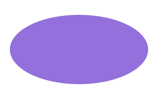
Evg.ellipse
    [ Evg.fillStr "mediumpurple" ]
{ rx = 70, ry = 35, center = ( 80, 50 ) }Draws a closed shape by connecting a list of corner points with straight lines. The last point connects back to the first automatically, so three points make a triangle, four make a quadrilateral, and so on.
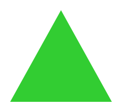
-- A triangle:
Evg.polygon [ Evg.fillStr "limegreen" ]
    [ ( 60, 10 ), ( 110, 100 ), ( 10, 100 ) ]
For shapes with curved edges, see path.
Draws a connected series of straight line segments through a list of
points, like a line chart. Unlike polygon the shape stays open:
the last point does not connect back to the first. It comes out as a thin
black line with nothing filled in.
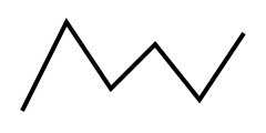
Evg.polyline []
    [ ( 10, 50 )
    , ( 30, 10 )
    , ( 50, 40 )
    , ( 70, 20 )
    , ( 90, 45 )
    , ( 110, 15 )
    ]
Drawing Text
Draws a line of text at a position.
The y coordinate is the text's baseline, the invisible line the letters sit
on, so the characters appear above the point you give (with descenders like
the tail of a "g" hanging below it). The anchor says where the text sits
horizontally relative to x:
Start: the text begins atxand runs to the rightMiddle: the text is centered onxEnd: the text ends atx, running to the left of it
Middle is what you want for labelling a point, like the value above a bar
in a chart.
Evg.text [ Evg.fillStr "black", Evg.fontSize 24 ]
    { x = 50, y = 50, anchor = Evg.Start }
    "Hello"
For multiple styles within one line, or text that flows along a curve, see
the Evg.Text module.
Where text sits relative to the position you give it. See
text for what each option looks like.
Images
Places an image file (PNG, JPG, SVG, and so on) into the drawing. The
href is the image's URL, and the rectangle says where it goes and how big
to draw it. If the rectangle's proportions don't match the image's, the
image is scaled to fit inside without distortion.
Evg.image []
    { href = "photo.png"
    , x = 0
    , y = 0
    , width = 200
    , height = 150
    }
Paths
Draws a free-form shape from a list of pen movements: place the pen
somewhere, then draw straight lines, curves, and arcs from point to point.
This is the most flexible shape and the one to reach for when rectangles,
circles, and polygons aren't enough. The movements themselves are described
with the Evg.Path module.
You pass a list of subpaths. Most shapes need just one; several subpaths make a compound shape, where an inner subpath can cut a hole in an outer one.
import Evg.Path exposing (Path(..), PathSegment(..))


-- A smooth arch drawn with a single curve:
Evg.path
    [ Evg.fillStr "none", Evg.strokeStr "black" ]
    [ M ( 10, 80 )
        [ C ( 40, 10 ) ( 65, 10 ) ( 95, 80 ) ]
    ]


-- A donut: an outer circle with a smaller
-- circular hole cut out:
Evg.path [ Evg.fillStr "gold" ]
    [ M ( 50, 10 )
        [ A 40 40 0 True True ( 50, 90 )
        , A 40 40 0 True True ( 50, 10 )
        ]
    , M ( 50, 25 )
        [ A 25 25 0 True False ( 50, 75 )
        , A 25 25 0 True False ( 50, 25 )
        ]
    ]
Attributes
Colors and painting
Applies an image effect to a shape after it is drawn, like blurring it or
giving it a drop shadow. Effects are built with the
Evg.Filter module.
import Evg.Filter as Filter


blur =
    Filter.sourceGraphic |> Filter.gaussianBlur 3


-- A circle with softly blurred edges:
Evg.circle
    [ Evg.filter blur ]
{ r = 50, center = ( 100, 100 ) }Like filter, but with explicit control over the region the effect is
allowed to paint into.
Effects often need room beyond the shape's edges: a blur bleeds outward, a drop shadow sits below and to the side. By default the region extends slightly past the shape, which suits most cases. If an effect appears cut off at a straight edge, widen the region with this function.
Evg.text
    [ Evg.filterWithCoordinates
        (Evg.objectBoundingBox
            { x = -0.25
            , y = -0.25
            , width = 1.5
            , height = 1.6
            }
        )
        myFilter
    ]
    { x = 100, y = 50, anchor = Evg.Middle }
"Hello"Paints the inside of a shape. The Paint value can be a solid color, a
gradient, or a repeating pattern; see Evg.Paint for how to
build them.
import Evg.Paint as Paint


Evg.rect
    [ Evg.fill
        (Paint.solid (Color.rgb255 0 128 255))
    ]
    { x = 0, y = 0, width = 100, height = 100 }
If you just want a color and are happy writing it as a string, fillStr is
shorter.
Paints the stroke of a shape, the visible line drawn along its edge.
Like fill, it takes a Paint value, so outlines can be gradients or
patterns as well as solid colors.
import Evg.Paint as Paint


Evg.circle
    [ Evg.stroke
        (Paint.solid (Color.rgb255 0 0 0))
    ]
{ r = 40, center = ( 50, 50 ) }Colors the inside of a shape, using any color notation CSS understands:
named colors, hex codes, rgb(...), and so on. Pass "none" to leave the
inside unpainted so anything behind the shape shows through.
Evg.fillStr "red"


Evg.fillStr "#FF0000"


Evg.fillStr "none"Colors the stroke of a shape (the line along its edge), using any color
notation CSS understands. Pass "none" to remove the outline.
For gradient or patterned outlines use stroke. For dashes and
line endings see dashPattern and the line cap and join
functions below.
Evg.strokeStr "black"


Evg.strokeStr "#FF0000"Sets how thick the stroke is drawn, in the same units as your coordinates. The line straddles the shape's edge, half inside and half outside.
Evg.strokeWidth 2Makes a shape translucent. At 1.0 the shape is fully solid, at 0.5
whatever is behind it shows through evenly, and at 0.0 it is invisible
(though still present, so it can still receive clicks).
Evg.opacity 0.5For gradient and pattern constructors, see Evg.Paint.
Stroke style
Draws the stroke as dashes instead of a continuous line. The numbers alternate between the length of a dash and the length of the gap after it, repeating along the whole line.
-- 10-unit dashes with 5-unit gaps:
Evg.line
    [ Evg.strokeStr "black"
    , Evg.dashPattern [ 10, 5 ]
    ]
    ( 0, 50 )
    ( 200, 50 )


-- Dot, gap, dash, gap, repeated:
Evg.dashPattern [ 2, 5, 10, 5 ]Slides the dash pattern along the line by the given distance. Animating this value makes the dashes appear to march along the path, the classic "marching ants" selection effect.
Evg.dashOffset 5Gives lines rounded ends: a semicircle caps each endpoint, extending half the stroke width past it. This is what makes thick lines look friendly rather than abruptly chopped.
Gives lines square ends that extend half the stroke width past the endpoint. Similar to the default flat end, but the line reaches slightly further.
Cuts lines off flat exactly at the endpoint. This is the default.
Rounds off the corners where two line segments meet, as if drawn with a round pen.
Flattens the corners where two line segments meet, as if the sharp point had been snipped off.
Keeps corners as sharp points. This is the default look.
Very acute angles would produce absurdly long spikes, so the limit caps
how far the point may extend (as a multiple of the stroke width) before the
corner falls back to a flattened bevel. A typical value is 4.
Evg.linejoinMiter { limit = 4 }Makes just the outline translucent, leaving the fill untouched. 0.0 is
invisible and 1.0 fully solid.
Makes just the interior fill translucent, leaving the outline untouched.
0.0 is invisible and 1.0 fully solid.
Changes which regions count as "inside" a self-overlapping shape.
When a path crosses over itself, or one subpath sits within another, the browser has to decide which enclosed regions get filled. With this rule, a region is filled only if a line drawn from it to the outside crosses the shape's edge an odd number of times. In practice: overlapping areas become unfilled holes.
The default rule for deciding which regions of a self-overlapping shape get filled: a region is filled unless the strokes enclosing it wind in opposite directions and cancel out. In practice: overlaps stay filled, and you cut holes by drawing the inner subpath in the opposite direction from the outer one.
Shape options
Rounds the corners of a rectangle. The radius is the size of the quarter-circle used at each corner, so bigger numbers give softer corners. A radius of half the rectangle's height turns the short ends into semicircles, giving a pill shape.
Evg.rect [ Evg.fillStr "blue", Evg.cornerRadius 10 ]
{ x = 0, y = 0, width = 100, height = 60 }Sets the text size. The number is the height of the font in your coordinate units, so text scales along with the rest of the drawing.
Evg.fontSize 24Sets the typeface for text. You can list multiple fonts separated by commas as fallbacks, just like in CSS.
Evg.fontFamily "'Helvetica Neue', Arial, sans-serif"Accessibility
Adds a short text label to a shape for screen readers and tooltips. Browsers will typically show this as a tooltip on hover.
Evg.circle [ Evg.title "Connection status: online" ]
{ r = 5, center = ( 10, 10 ) }Adds a longer text description to a shape for assistive technology.
Unlike title it never appears as a tooltip; it exists purely for screen
readers, so this is the place to describe what a complex graphic shows.
Evg.group
    [ Evg.desc "Bar chart of monthly revenue" ]
    [ ... ]
CSS
Assigns a CSS class name for external styling.
Evg.rect [ Evg.class "highlight" ]
{ x = 0, y = 0, width = 100, height = 100 }Applies inline CSS directly to an element, as one string of declarations.
Evg.style "filter: drop-shadow(2px 2px 2px grey)"Utilities
An element that draws nothing. Handy when a branch of your code has nothing to show:
if model.showMarker then
    Evg.circle [] { r = 4, center = model.position }


else
Evg.noneChanges the message type of a drawing, just like Html.map. Use it to
embed a drawing whose event handlers produce one message type into a view
that uses another.
Attribute Utilities
Bundles several attributes into one, so you can name a reusable style and apply it as a single attribute.
buttonStyle =
    Evg.batch
        [ Evg.fillStr "blue"
        , Evg.strokeStr "navy"
        , Evg.strokeWidth 2
        ]


view =
    Evg.rect
        [ buttonStyle ]
{ x = 0, y = 0, width = 80, height = 30 }An attribute that does nothing. Useful as a placeholder or default.
Evg.rect
    [ if highlighted then
        Evg.fillStr "yellow"


      else
        Evg.noAttr
    ]
{ x = 0, y = 0, width = 50, height = 50 }Conditionally include an attribute. When the condition is False,
produces noAttr.
Evg.rect [ Evg.when isActive (Evg.fillStr "green") ]
    { x = 0, y = 0, width = 50, height = 50 }
Serialization
Render the drawing to a string of SVG markup instead of Html. Takes
the same arguments as svg, so a scene can be shown live or written
to an .svg file with the same code.
Evg.toString []
    { width = 100, height = 100 }
    [ Evg.circle []
        { r = 40, center = ( 50, 50 ) }
    ]
The result is a complete SVG document: an <svg> root carrying the namespace
and viewBox, containing a <circle> element with the radius and center you
gave.
Useful for generating image files in scripts, snapshot-testing drawings, or rendering on a server. A few things behave differently from live rendering:
- Event handlers are dropped. Markup is a picture, not a program.
Evg.Performance.lazyshapes are computed (there is nothing to cache).- Raw nodes smuggled in from outside the library cannot be read back out of the virtual DOM, so they are omitted.
A piece of a picture: a single shape, some text, or a group of other pieces. Your whole drawing is a tree of these, and
svgturns that tree intoHtml.